What is the Kano Model?
Developed by Noriako Kano in the 1980’s, the Kano Model says that your customers will react in one of the following ways about each of your product’s features:
- 😍 Delighters: “Nice! I didn’t expect that, and I love it!”
- 😎 One-Dimensional: “I like that. I’ll have a little more please, and don’t take any away.”
- 😐 Must-Haves: “Well yeah. Of course it has that, it’d be stupid not to.”
- 😴 Indifferent: “Meh. Whatevs.”
- 😡 Reverse: “WTF. This new crap complicates things and the old way was better. Can you take this out?”
You can determine which features belong in which categories by asking your customers about each one. And then, you’ll have a better sense of what to build, improve, or kill.
Taking the raw data from that questionnaire and charting it is a little more difficult than you might expect, but I’ll share some of my work that will hopefully make things faster for you to implement than it was for me.
But first.
The Kano Model
Don’t freak out and don’t get stuck trying to dissect it. It’s confusing at first, but help is coming!
It looks like this:
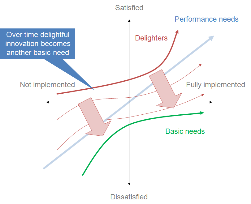
Source: https://en.wikipedia.org/wiki/File:Kano_model_showing_transition_over_time.png
Or this:
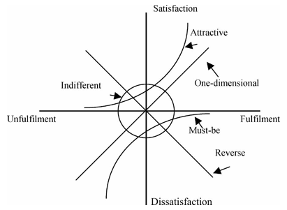
Source: http://foswiki.cs.uu.nl/foswiki/MethodEngineering/UserExperienceGradingviaKanoCategories20112012
If you’re smarter than I am, those images make sense at first glance.
But, if you’re like me, you’re thinking:

Let’s take it apart. And remember those five primary user reactions from a second ago:
- 😍 Sweet!!
- 😎 Cool, keep it up.
- 😐 Well, yeah.
- 😴 Meh.
- 😡 Dafuq?!
We’ll start with the X-Axis, which indicates level of implementation.

Way over to the left, the feature may not even be conceived of, let alone added to the product.
On the right, the feature is signed, sealed, and delivered.
The Y-Axis indicates how satisfied your customers are with the feature.

Up top, we’re happy. At the bottom, we’re pissed.
Pretty simple.
Delighters 😍
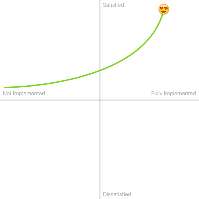
When Delighters aren’t implemented (far left), nobody is dissatisfied. Nobody cares that it doesn’t exist because it isn’t expected. But, once it gets to a certain degree of implementation, they’re blown away.
Delighters are pretty much what Disney does for a living.
If you fly in to Orlando and are staying at a Disney property, this is what happens:
- You step off the plane.
- You can skip going to baggage claim and instead head straight to ground transportation where a charming bus (they call it a motorcoach) is waiting to take you to your hotel.
- Your bags? Disney collects them for you and delivers them to your room.
That’s the sort of thing that you don’t expect on your vacation, but when it happens, you make hyperbolic claims like, “This is the best thing ever. From now on, every vacation, we come here.”
One-Dimensional 😎
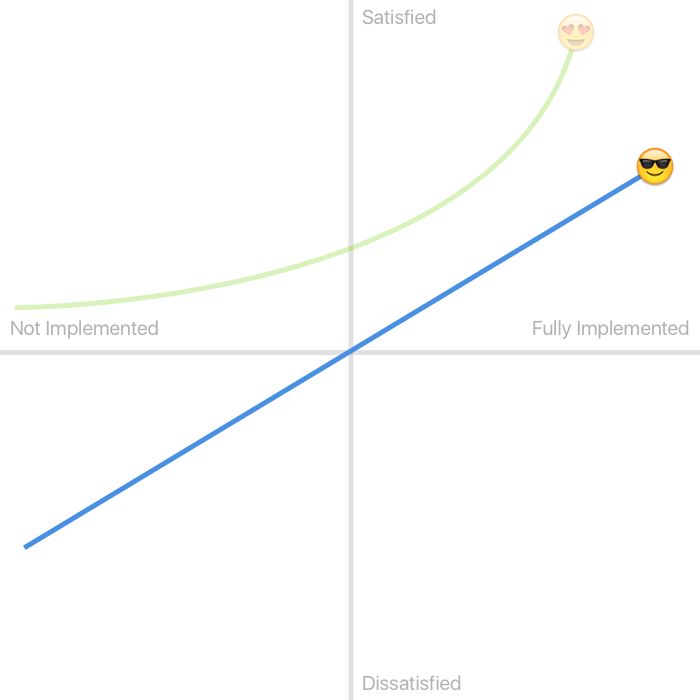
You’ll also see these referred to as “Performance attributes”, but I prefer one-dimensional. Add more, I like it. Take it away, I dislike it. Companies compete head-to-head on these attributes.
Examples:
- Megapixels
- Miles per Gallon
- Thread count
- Monthly data allowance
Unlike Delighters and Must-Haves, these are attributes that are typically stated and are top-of-mind for your existing and potential customers.
Must-Haves 😐
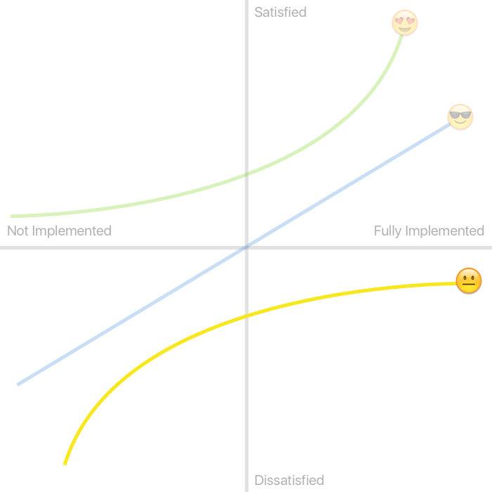
You don’t get credit for implementing Must-Haves and you will take serious heat if you fail to provide them.
Like Delighters, these are attributes that your customers are unlikely to mention in a survey or focus group. In the case of Delighters, they wouldn’t mention them because it would never occur to them to ask for it, but in the case of Must-Haves, it’s because it’d be unthinkable that you wouldn’t provide it.
Nobody writes a hotel review that says, “This place was great! The bed had a comforter and the bathroom came with toilet paper! Definitely stay here!”
Follow the yellow line to the left towards Not Implemented and you can imagine what that hotel review would sound like if the hotel room didn’t have proper bedding or toilet paper.
Now follow the yellow line to the right and notice the diminishing returns. If the hotel room has zero rolls of toilet paper, it’s anarchy. One and maybe it’s fine, but two would be better. But you’re not earning any additional customer satisfaction by stocking the room with eight rolls compared to five. At a certain point, the customer’s basic needs have been met, and “over-implementing” doesn’t earn any points.
Indifferent 😴
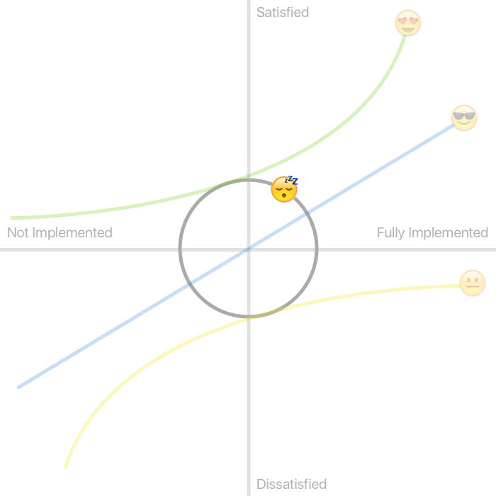
These features don’t register in your customers’ minds. A great example I read somewhere would be a vending machine that accepts $1 coins. Doesn’t bother me that it’s there, but I also don’t care that it is.
This makes me think of my microwave.
Here is my microwave’s control panel.

Here are the buttons I press.

I would probably prefer that everything else wasn’t there for simplicity. But I’m not necessarily annoyed. As far as I’m concerned, Popcorn, Keep Warm, and the others fit right inside of that boring grey circle in the middle of the chart.
Reverse 😡
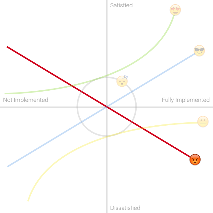
A Reverse feature is the opposite of a One-Dimensional feature. The more you add, the more angry your customers become, and the more of it you remove, the more they enjoy your product.
If my microwave had ten more buttons that I never used, then it’d start to be seriously cluttered and I’d be bothered enough to want them gone.
I recently bought a great new card game. It’s a ton of fun, and my wife and I can play it with our kids who are equally entertained. The only problem is that the cards aren’t like regular playing cards, they’re super slick and slide all over the place. They don’t shuffle well, it’s hard to keep them stacked, and they don’t “handle” the way playing cards typically do. This slickness feature of the cards reduces my enjoyment of the game, and I wish it wasn’t there. If the next version of the game has even slicker cards, I’d like it less, and if they went to regular old playing card finish, I’d consider buying that version because I would consider less of that feature to be an upgrade.
The Model. Again.

Source: https://en.wikipedia.org/wiki/File:Kano_model_showing_transition_over_time.png
Hopefully, this makes more sense now.
And the two big arrows and thin red lines? You may have already guessed this, but as time passes:
- Delighters become One-Dimensionals
- One-Dimensionals become Must-Haves
Think back to the hotel room example. Every single thing we expect to see when we arrive was at one point in time utterly delightful, but is now a basic expectation.
So, whether this pattern is a good or bad thing for society in general is for someone else to tackle. I’m just pointing out that it’s a thing.
Anyway. Now that we’ve got a better understanding of what that chart means, how exactly do you go about discovering which category your features belong in?
- Part Two:Create Your SurveyKano Model (Part 2): Creating a Kano Model Survey for Customer FeedbackA step-by-step guide to creating and interpreting a Kano Model survey, avoiding false positives, and identifying key features to satisfy and delight customers.
- Part Three: Chart the Results (coming soon)
Free 15-Minute Consultation
Are you building a product and need some guidance deciding what to build, what to ignore, and what to add later?
Schedule a free 15-minute conversation and I will help you get unstuck so you can start making progress!

